


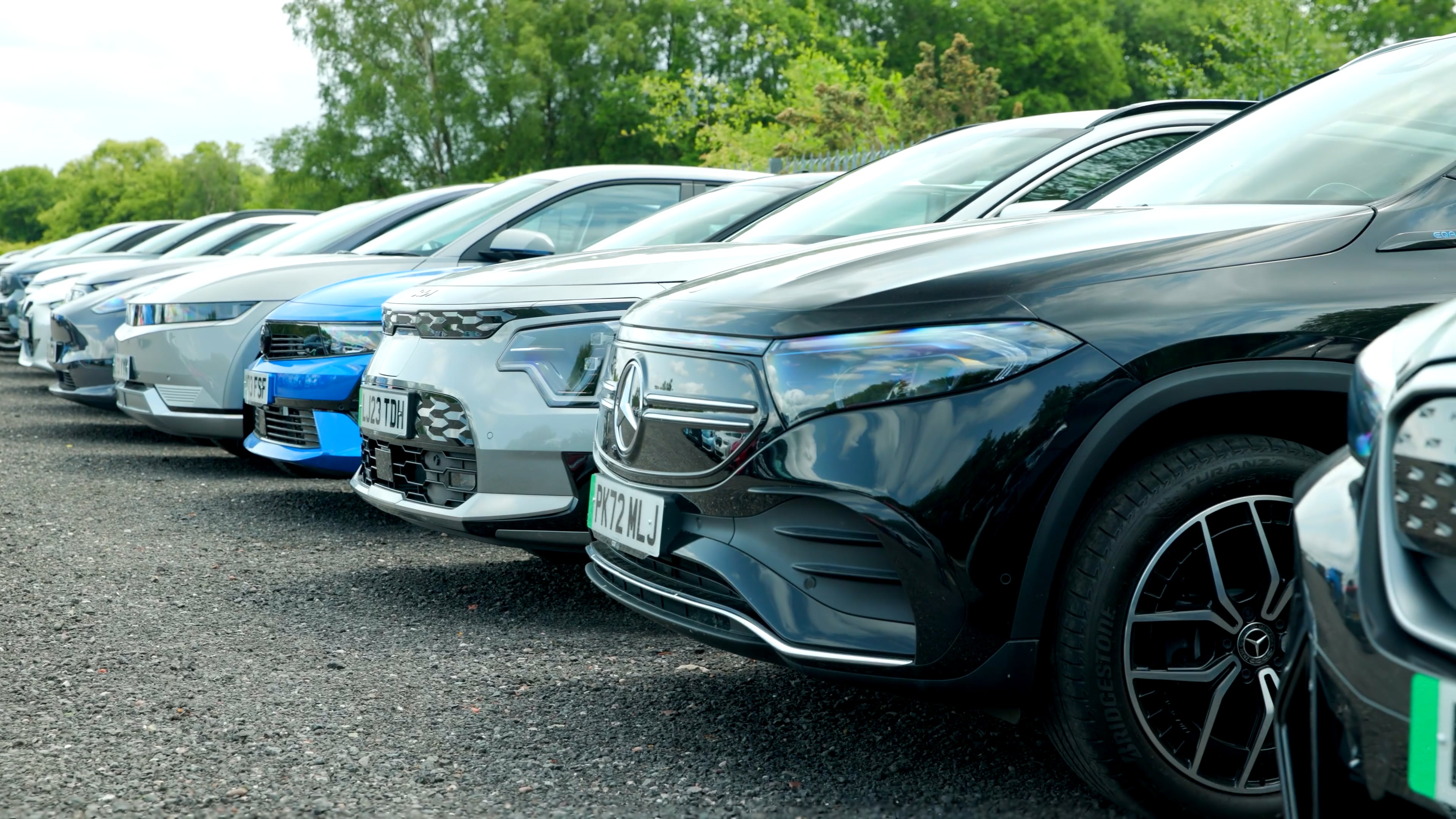

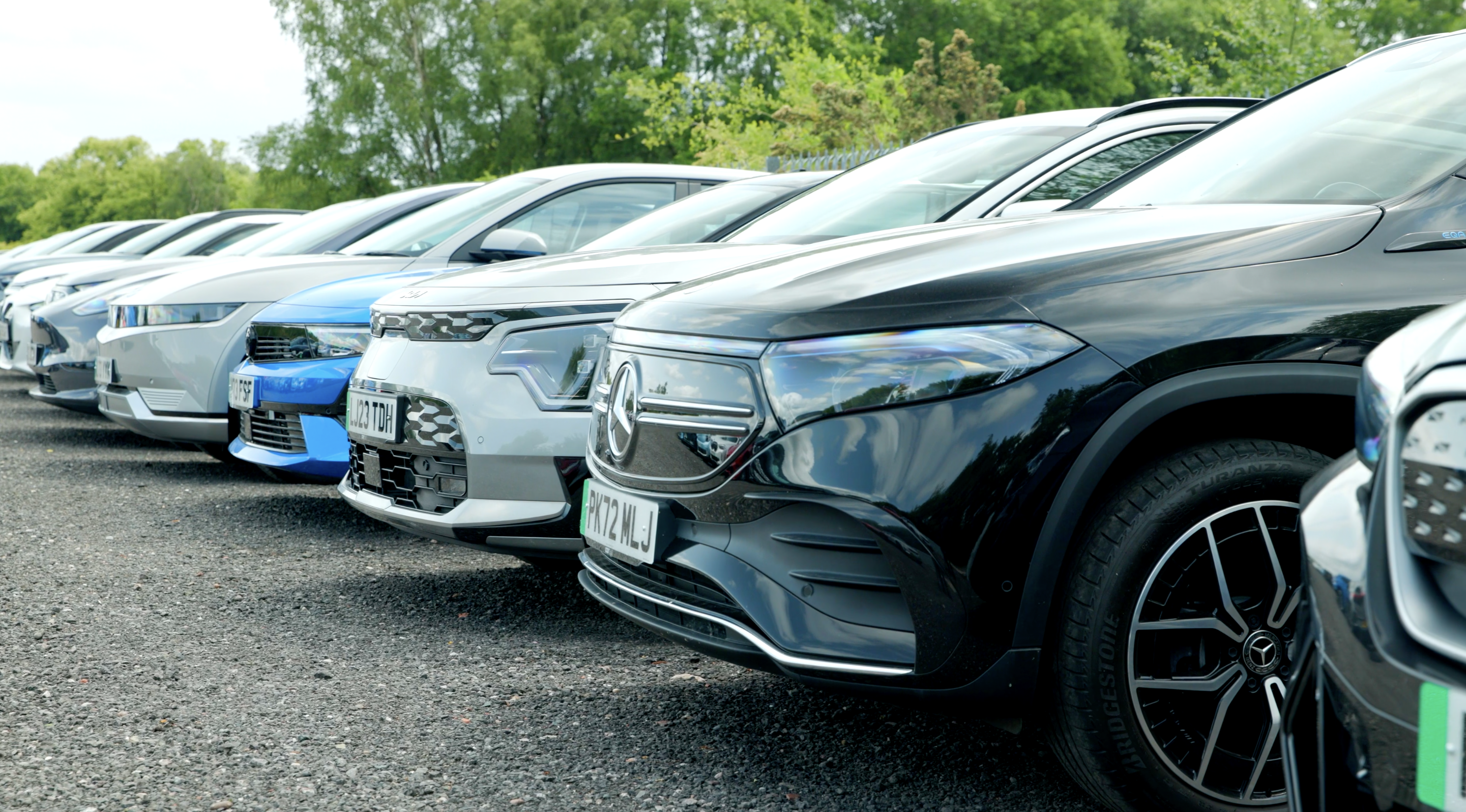

Find my EV
Explore a broad selection of high quality used EVs. Enjoy competitive pricing and flexible finance, along with certified battery health checks and a smooth, straightforward experience.
Filters

Remove Filters
 Price
Price
Price Make & Model
Make & Model Battery Range
Battery Range Age
Age
Age Mileage
Mileage Colour
Colour Body Type
Body Type Drive Type
Drive Type Doors
Doors
Doors Seats
Seats
Seats Offers
OffersFind my EV
Explore our wide range of high-quality used EVs.
Speak to an EV expert and find your perfect match.
Get in touchPersonal Contract Purchase (PCP) representative example
Based on a cash price of £12,450 with a £1,000 customer deposit,
borrowing £11,450 at a representative APR of 8.9% and the following:
Based on a cash price of £12,450 with a £1,000 deposit, borrowing £11,450 over 48 months at a representative APR of 8.9%.
48 monthly payments of £182.62. Fixed interest rate per annum: 3.89%. Optional final payment: £5,738.50. Amount of Credit: £34,999.00. Amount of interest: £1,779.38. Total amount payable: £15,504.26. Annual mileage limit: 10,000 miles. Excess mileage charge: 9.4p per mile
48 monthly payments of£182.62
Fixed rate of interest per annum3.89%
Amount of Credit£34,999.00
Option-to-purchase fee£10
Optional final payment£5,738.50
Amount of interest£1,779.38
Total amount payable£15,504.26
Annual mileage limit10000 miles
Excess mileage charge9.4p per mile